If you’re here, you’re probably asking yourself how to increase conversion rates for your website. You’re not alone – it’s a classic conundrum.
While you have no trouble attracting website visitors, who spend plenty of time on it, there’s still something missing. A make-or-break metric that every ecommerce business’s success depends on it.
We’re talking, of course, about conversion rate.
This is the percentage of people visiting your site that have taken a desired action: be it purchasing, signing up for more information, or submitting their contact details. Essentially, conversion rate is a measure of how much your audience wants what you’re providing – and how easy you’re making it for them to get it.
If your conversion rate isn’t too hot, it could mean there isn’t much of an audience for your product or service. If that’s the case, well… we can’t do much about that!
But it could also mean you just haven’t optimized your site to maximize conversions. If this is the case, we can help.
We’ve put together the best ways to improve conversion rates, so read on for 14 tried-and-tested ways to boost your website conversions. Be it through behavior tracking, pop-ups, forms, chatbots, or trust signals, these methods will help ensure your audience isn’t just viewing your website….
…but doing exactly what you want them to.
Fast page speeds affect conversions. Why compromise?
Choose the very best ecommerce hosting to maximize your conversion rate.
14 Excellent Ideas to Help You Boost Conversions in 2022
Ready to learn how to improve website conversion rates yourself? Let’s go!
1. Add Exit-Intent Pop-Ups to Your Site
We’ve all been there. Scrolling a website, you get bored and decide to click away.
As you do, though, a pop-up appears – as if out of nowhere – offering you an unmissable deal. An exclusive offer? That expires in just a few moments? You’d be mad to turn it down.
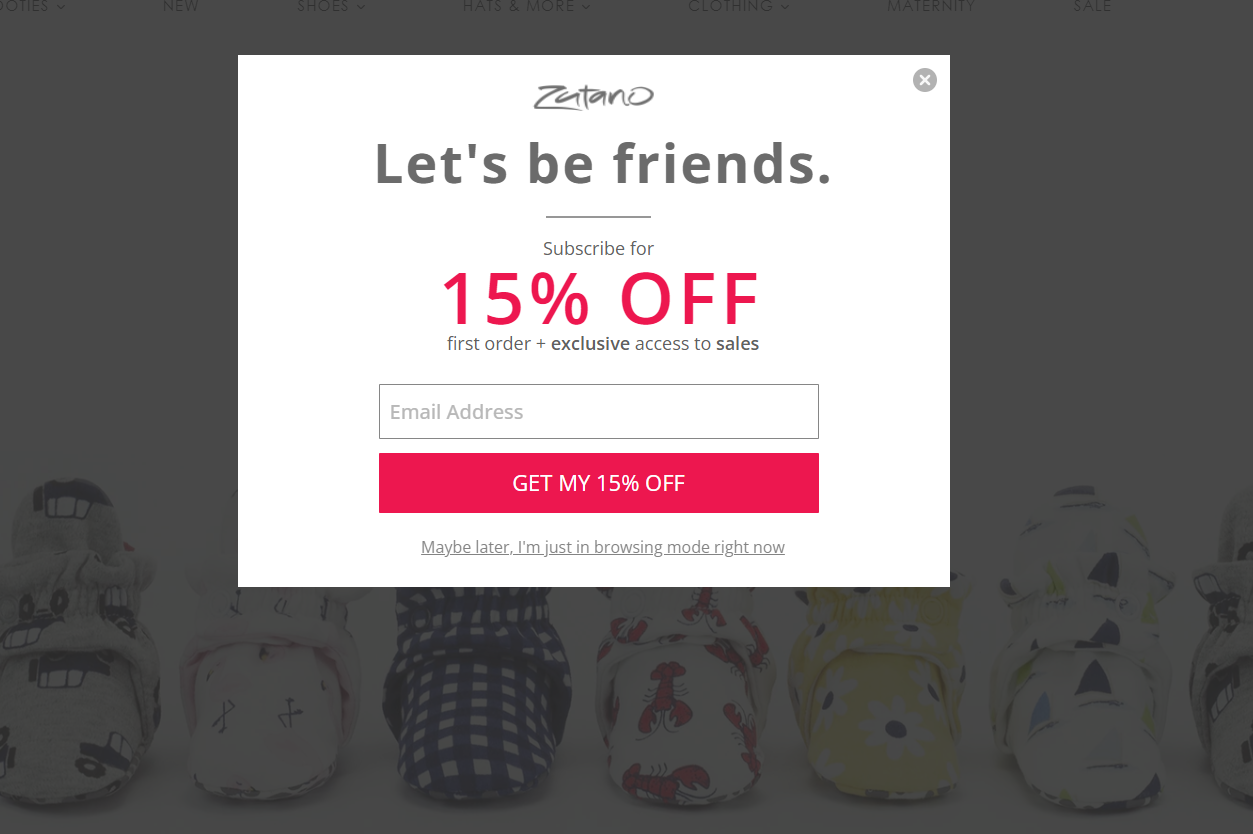
Zutano utilizes exit-intent pop-ups to great effect, using a discount to encourage newsletter sign-ups.
This is called an exit-intent pop-up. And, if you’ve ever been snared by such a ploy yourself, you’ll know how effective they can be.
One blogger, for instance, boosted her conversion rate by a staggering 1,300% this way, while other (more moderate) statistics suggest exit-intent pop-ups can boost conversation rates by 10-15% – and boost your revenue by up to 30% in the process.
So, how exactly do exit-intent pop-ups increase website conversions?
Exit-intent pop-ups track the movements of your user’s mouse to understand how they’re accessing your site. When it looks like they might be on their way out – back to the search engine results page, and potentially into the waiting arms of a competitor – a pop-up appears with a CTA (call to action) to lure them back in.
You can add an exit-intent pop-up to your site with ease via a plugin – OptinMonster, Getsitecontrol and OptiMonk all work well. Then, you’ll need to make sure it’s colorful enough to catch the eye, and compelling enough to hold the attention. So be sure to check out a few excellent exit-intent pop-up examples first to get inspired.
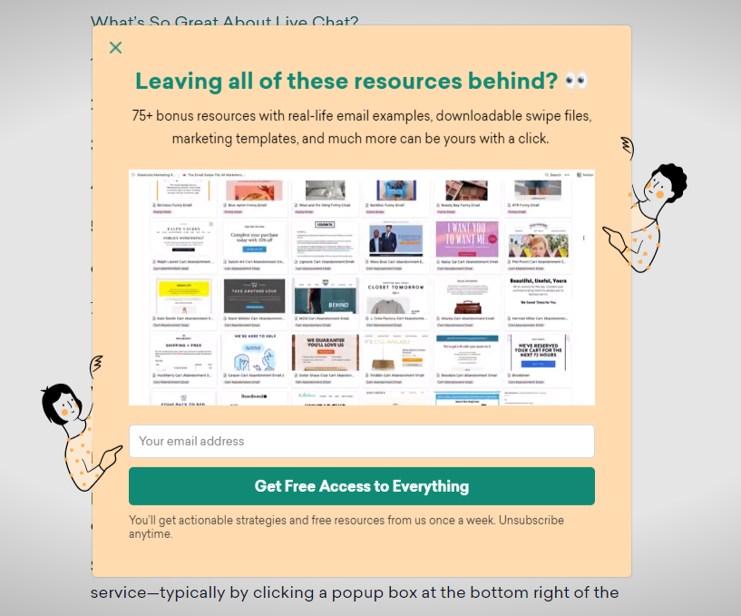
This exit-intent pop-up from Sleeknote uses pointing illustrated figures to draw your attention to its content and encourage you to sign up to its email.
2. Prepare Concise Forms
Your customers are time-poor.
They have a million and one things to be doing – so the easier you can make it for them to engage with your business, the more likely they are to do so. And the more likely you’ll be able to improve conversion rates as a result!
That means making your forms as simple as possible – stripping them back, and removing any unnecessary fields. (You don’t need a person’s phone number to sign them up to your email list, for example!)
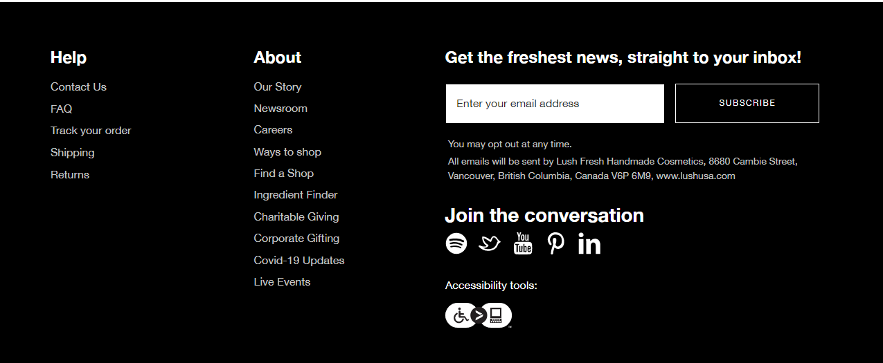
Lush’s email sign-up form is so simple it fits in the site footer. It’s very clear and easy for users to subscribe – no hassle!
By cutting down your forms, you also cut out the time, energy, and hassle involved for your prospective customer. You’ll attract more leads, win more sign-ups, and get more people clicking – and converting. It’s also important to take steps to reduce contact form spam.
3. Leverage Social Proof on Your Site
So, you want to learn how to improve conversions? You’ll need social proof!
When it comes to social proof, the statistics are conclusive. 88% of consumers trust user reviews as much as personal recommendations, while a whopping 92% put their faith in non-paid endorsements over traditional forms of advertising.
Of course, that doesn’t mean you shouldn’t market to your audience. It just means you need your audience to help you market.
How? By harnessing the power of social proof on your site.
Here, we’re talking about anything that lends credence and credibility to your brand. Reviews, testimonials, logos of high-profile businesses you’ve already successfully served – all will do the trick. You can also put extensive case studies together, in which you describe at length a specific problem you solved for a customer.
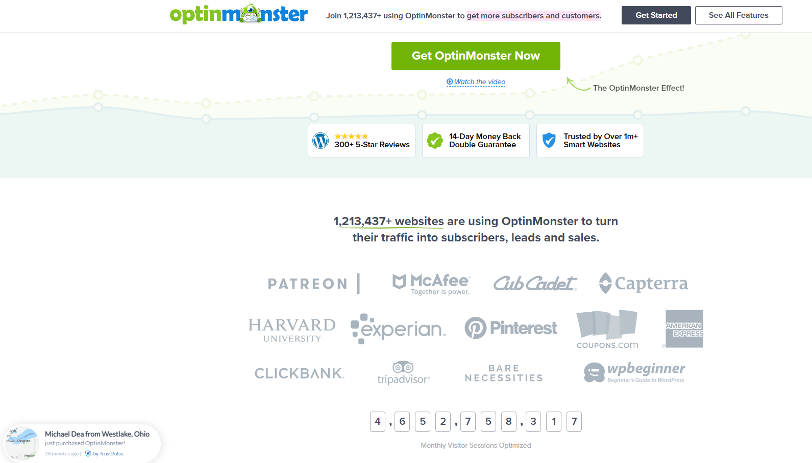
OptinMonster uses social proof all over its homepage, from the number of people using its services, to small pop-ups telling you when someone new has just signed up!
You can add social proof directly to your site, by embedding testimonials into its interface. But it’s also a good idea to link directly to whichever sites house reviews of your business: especially aggregators such as Trustpilot, TripAdvisor, G2 Crowd, Capterra, and Yelp.
4. Identifying Conversion Points from User Behavior
When you ask how to increase conversion rate, there are plenty of quick fixes. But to see the best results – and treat the cause, rather than the symptoms – you’ll need a solid understanding of how your site’s users are navigating your interface.
Where are they landing on your site? Which pages are they viewing? What’s their typical journey with your website, from start to finish?
And, most importantly, where are they leaving? Understand this, and you’re one step closer to figuring out why they’re leaving – and being able to prevent it.
In short, the better you understand your users’ behavior, the easier you’ll find it to boost conversion rates.
One tool you can employ to this end is Hotjar, which presents you with heatmaps of user behavior. It’ll paint a picture of where their cursors are lingering, which buttons they’re skipping over, and what they’re avoiding altogether. Other methods involve analyzing when a customer has abandoned a purchase at checkout, or quit filling out a form halfway through.
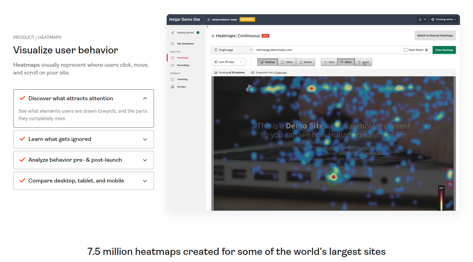
Hotjar is a popular tool for viewing heatmaps that show how users are interacting with your website.
From here, you’ll be able to put yourself in the shoes of your website’s visitors, And, when it comes to increasing your conversion rate, will know exactly where to start.
Use CRO & Analytics Tools to Understand What Works
With more sites than ever all competing for an increasingly thin sliver of customer attention, CRO (Conversion Rate Optimization) has experienced a meteoric rise.
CRO is both an art and a science. It involves understanding the nature of our brains and behaviors to maximize the likelihood of a customer converting. Then, it’s a process of trial and error: changing the color of a button or the wording of a CTA, then testing, testing, and testing again.
There are also a range of CRO and analytics tools available – and, when you’re considering ways to increase conversion rates on your own site, they’re an excellent place to start.
These tools include:
- Optimizely
- Convincely
- Crazy Egg
- Instapage
- Adobe Analytics
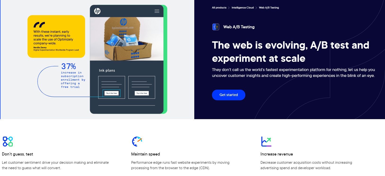
Optimizely is just one example of a CRO tool, which lets you A/B test elements of your site and experiment on your site.
Of course, Google Analytics is ideal for the basics. It’s free, and equips you with your site’s historical and current conversion rate, traffic, and user demographics. It arms you with an arsenal of info about where users are coming from, how long they’re spending on each page, and whether or not they’re ‘bouncing’ straight off again.
Get to grips with all this, and you’re halfway toward overhauling your site experience – and increasing your conversion rate.
5. Remove Unnecessary Steps From Your Conversion Funnel
You can’t answer the question how to increase conversion rate without talking about the conversion funnel, and optimizing it appropriately. From removing the need for users to create an account to offering multiple payment methods, removing bottlenecks in a funnel can make a huge difference for conversions.
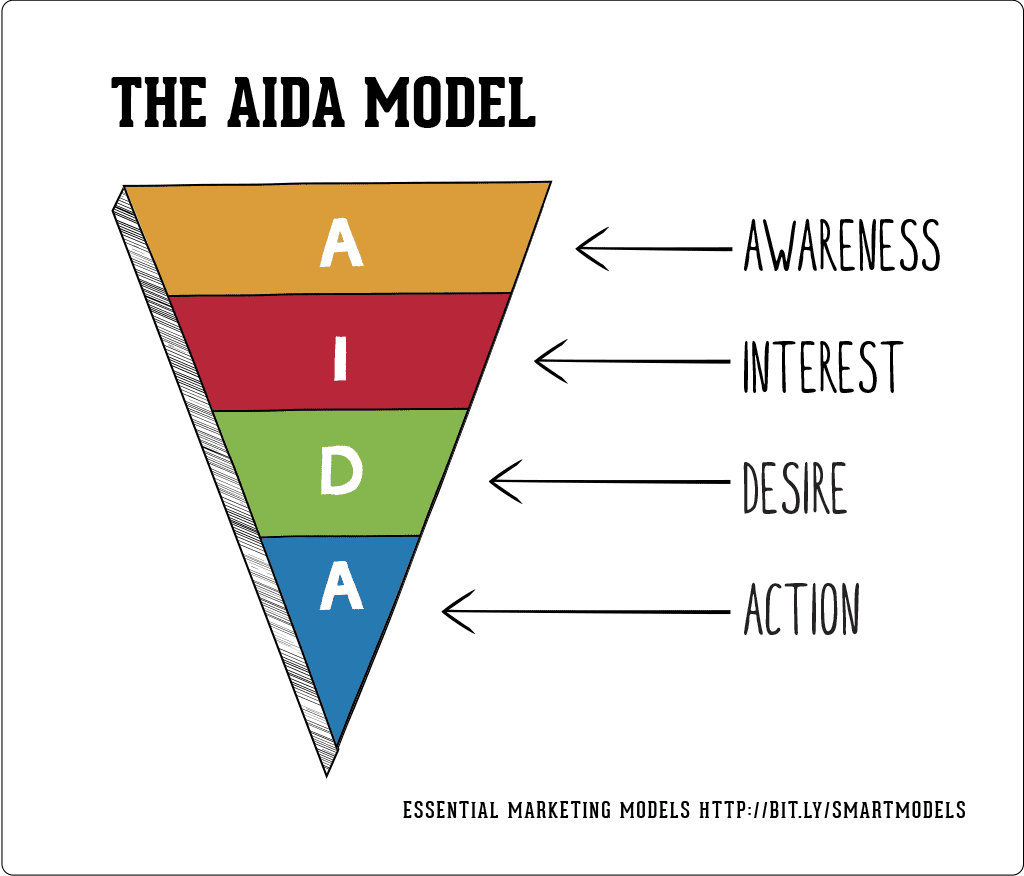
Smart Insights graphic of the AIDA funnel, a widely used online marketing funnel.
The conversion funnel is a sweet, slippery slope leading your site’s users straight to where you want them to be. Needless to say, keeping this particular slide clear and clutter-free is vital – so there’s no room for any unnecessary distractions.
Are you giving your user one too many forms to fill out before they can buy from you? Are you forcing them to wade through stacks of content and information before they can sign up for that free trial?
Was the whole thing too difficult – or did it simply take too long?
To understand all this, audit your site’s current funnel: plotting out each step of the user journey, identifying the drop-off points, and working out fixes.
By eliminating any distractions and diversions, you’ll minimize the time and effort required on your customer’s part. And get them from contact to conversion – quickly.
6. A/B Testing Onsite Pain Points
No website is perfect – there’s always room for improvement, and that’s where A/B testing comes in.
A/B testing allows you to test the effectiveness of your website elements, by running two variations of it at the same time.
But before you begin testing, you need to understand exactly what you should test. You need to understand what your customers’ pain points are. Pain points are challenges or problems that face your users – whether it’s a too-complex contact form or a cluttered homepage.
1. Understand Your Users’ Pain Points
The first step is to develop a comprehensive understanding of your audience’s pain points.
Conduct Online Surveys
There’s a simple way to understand your customers’ pain points – ask them! Run surveys, polls, or simply invite them to leave reviews or feedback telling you what they would improve on your website.
Set Up Live Chat
Setting up a live chat on your site is a great way to engage directly with your users, and get real-time feedback on their problems. By tracking common complaints or challenges, this can shine a light on areas that may be worth testing!
Listen Carefully
Seek out reviews on sites such as TrustPilot, Google, Yelp, Amazon, or even TripAdvisor, and see what your customers have said about you, your products, and your service.
You can also keep an active watch on social media to see what people are sharing across Facebook, Twitter, or Instagram. Angry customers are twice as likely to leave a review than a happy customer, so you should have plenty of material to work with!
2. Test, Test, Test!
Once you understand your users’ pain points, you can then begin testing to improve user experience and, in turn, increase your website conversion rates.
Here are some examples:
Pain Point: Purchasing Process Is Too Long/Complex
A/B Test Options:
- Guest checkout
- One-click purchasing
- Give customers the option to save their details for next time
Pain Point: Support Is Too Hard to Contact
A/B Test Options:
- Live chat function
- Social media support
- Contact form placed visibly on the homepage
Pain Point: Website Is Hard to Navigate
A/B Test Options:
- Use a sticky navigation menu
- Add more headings to help users scan pages
- Create clear homepage CTAs such as “Shop New Collection” or “Shop Sale”
Don’t try to test everything all at once – once you have a list of pain points, prioritize them, and start testing with the most pressing issue facing your customers, which is most likely to increase conversion rates.
7. Write Good Copy
Most marketers know that filling a site with good, well-written copy goes a long way to engaging an audience – and boosting organic rankings.
But high quality writing also goes a long way to increase website conversions. As well as building a recognisable brand tone for your audience, well optimized content also signposts users to relevant sections, and aids them along their decision making path.
Testing your copy to see what resonates best with your readers is important. As point 7 discusses, A/B testing applies to website copy too. It’s vital to see what language is most effective for converting.
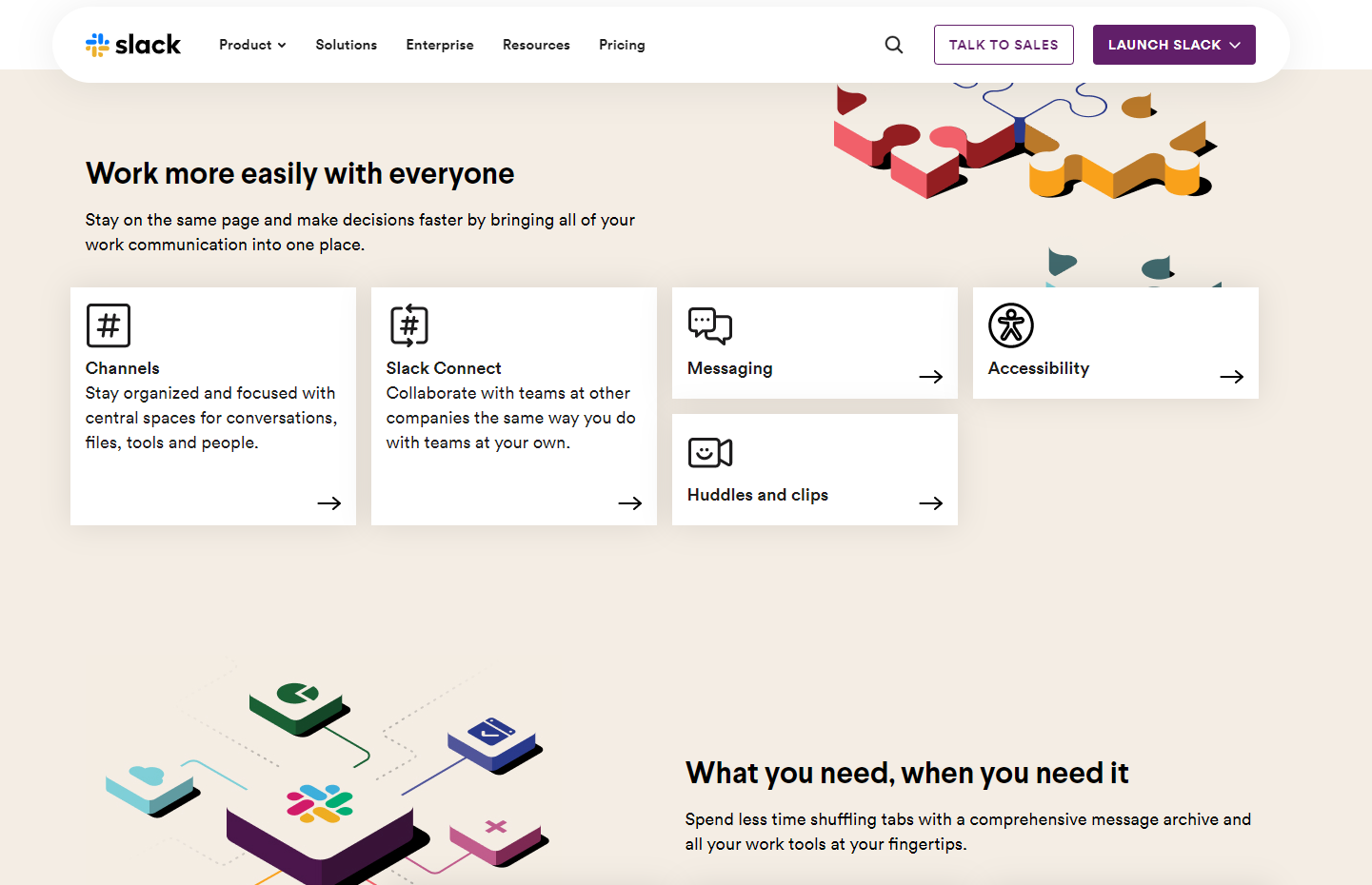
Slack’s website is a great example of smart web copy. It’s short, conversational, and gets straight to the point. Also notice how clear the CTAs are – be specific about the actions you want your users to take.
You’ll also want to make sure that your site’s copy is optimized for SEO (Search Engine Optimization). After all, if your site isn’t appearing at the summit of Google’s rankings, people won’t find it. And if they don’t find it, they can’t convert on it.
So be sure to choose the right SEO keywords and follow SEO best practices – those most relevant to your brand and industry – and integrate these naturally into the flow of the writing.
And, when writing conversion-focused copy, pay particular attention to your CTAs – they’re where you’ll need to get your potential customer over the line.
Here are some quickfire tips for constructing a killer CTA:
- The shorter, the better. Keep it snappy!
- Use strong verbs to impel your reader to action
- Tug on the heartstrings: appeal to your reader’s emotions to engage
- Get creative. The more wacky and wonderful your CTAs are, the more memorable they’ll be!
8. Create Effective Abandoned Cart Email Campaigns
Recent data suggests that the average cart abandonment rate is just shy of a staggering 70%. That means, of every ten customers that add an item to their online basket, just three are following that purchase through.
Scary statistic, huh? Indeed – but it doesn’t have to be.
By creating effective abandoned cart email campaigns, you can re-engage those lapsed customers, and re-ignite those missed opportunities. The way they work is simple. Whenever someone leaves with a full basket – without making a purchase – you send them an email to remind them.
To be even more compelling here, you can even include in that email a personalized discount – on the very item that shopper was perusing before they skipped out.
The more incisive your email’s design, contents, and timing are, the more alluring it’ll be to your potential customer. Trust us – your conversion rate will thank you for it!
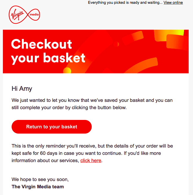
An example of an abandoned cart email from Virgin Media, providing the customer with the option to return to their shopping with the click of a button.
9. Define and Revise Your Website’s Value Proposition
Your value proposition is what you place in your business’s store window: that core, central function that attracts you to customers, and sets you apart from the rest.
And, if you don’t have a clear idea of what this is – or how to articulate it – you’re going to struggle to attract the right audience. (Let alone convert them!)
So to boost your rates of conversion and engagement, make sure that every facet of your site – from the copy to the design, and the UX to the UI – reflects your business’s value proposition.
Create buyer personas to paint a vivid picture of your audience. Understand what drives them – their pain points, goals, and frustrations – and be crystal clear in communicating how your product or service can solve these.
Doing all this will ensure that, no matter what other tricks and techniques you use to boost your conversion rate, your key messages are getting through to the right people. And landing!
10. Integrate a Live Chat Tool In Your Website
Ever been in a store – drifting around, unsure what to buy? You’re about to leave when, suddenly, the friendly store owner comes over and introduces themselves. They help you out, and – feeling confident and empowered – you make a purchase.
Sound familiar? Well, integrating a live chat tool will do just that – but for your online store.
And the data agrees. One study suggest that live chat – a feature which allows you to communicate with your customers in real time, via your site – boosts conversions by 20%. Another suggests that over half (51%) of consumers are more likely to buy from a company again if it offers live chat.
Why? Because live chat allows you to help your customer on the spot, as they’re umm-ing and ahh-ing about whether to buy from your brand. Through a potent blend of politeness and persuasion, you can solve any potential issues, and get the sale over the line – all in real time.
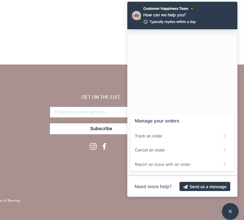
Online store, Olive and Piper, uses live chat to help with customer queries – using automated options for simple requests, and offering more in-depth support for more complex issues.
When you’re looking at how to increase conversions, implementing live chat, then, is a no-brainer – particularly when it’s as easy as it is.
You can add a live chat tool to your site via a third-party integration, or – in the case of some ecommerce website builders, such as Wix – do it directly through the site’s backend. Some website builders, like Squarespace, don’t offer live chat as a built-in feature, though. (Another win for Wix in the Wix vs Squarespace debate!)
11. Harness Trust Signals
Trust signals are a collection of factors that engender trust in your brand or business. They give your customers an indication as to whether to put their faith in your brand, so they’re important.
After all, would you walk into a store with a dirty, broken front window? Or that was cramped, ugly, or dimly-lit? Unlikely – and it’s exactly the same with your online store.
So don’t neglect the power that trust signals can have over your audience – and the impact they can have on your conversion rate if you get them right.
Some of the key trust signals to consider for your website are its:
- ‘About Us’ page: does it convey your identity and values?
- Navigation: is it clean, uncluttered, and intuitive to use?
- Page speed: is your site swift and simple, or does it take forever to load?
- Social proof: have you uploaded reviews, testimonials, and case studies?
- Social media: are you linking clearly to all your accounts?
- Contact details: do you have a physical address and phone number?
The more trust signals you add to your site, the more layers of credibility and authenticity you’ll slowly begin to build up. And, when users feel safer and more relaxed on your website – when it presents them with a consistent experience and identity – the more likely they are to convert.
12. Revise Your CTAs Regularly
Now you’re familiar with A/B testing, there’s no excuse for not regularly revisiting, revising, and reinvigorating your site’s CTAs. To keep trying out new hues, headlines, and button size, text, and design.
Let’s take a close look at how to increase website conversions using CTAs.
Explore the effect of strong colors such as red and orange on your conversion rate, and sacrifice the weak ‘Click Here’ for something more alluring – such as ‘Start Your 30-Day Free Trial Today’. You can even explore changing up the location of the CTAs on your site – making them larger and more eye-catching, or moving them to the top of the page for immediate visibility.
By revisiting your CTAs regularly, you’re not only keeping your site fresh from a visual perspective, but giving yourself a wealth of data about which CTAs convert – and which don’t. With this info, you can set your site up in the most strategic way possible – and equip it for sustainable long-term success.
13. Work on Improving Page Speed
Slow-loading pages aren’t just annoying for the user.
They’re potentially fatal for your conversion rate, too. One study from Portent demonstrated that conversion rates drop by 4.42%, on average, with every additional second of load time.
On the other hand, a page that loads quickly fares far better. In fact, it’s the pages with load times of 0-2 seconds with the highest conversion rates.
So how can you improve your site’s page speed and increase conversion rate? Here are three quick tips:
- Ensure your images are compressed. By running them through a free online tool (such as tiny.png) you’ll drastically reduce their file size, while losing little of their quality. It’s worth making sure they’re small, too – large images and fast websites don’t mix!
- Choose a different theme. If you’ve built your site on a CMS (Content Management System) or with a website builder (which are both simple and a great way to cut down on website costs), it’ll be built around a preset design template, or ‘theme’. Sometimes, the more elaborate, code-heavy of these can add a lot of weight to your site – so switching to a trimmer option can speed up your site. Check out our list of the fastest WordPress themes for more info!
- Minimize the amount of URL redirects. As your site expands and pages are added and removed, the amount of redirects can accrue. By auditing these excess links in the chain of communication, and replacing them with direct links, you’ll be doing your site speed a big favor.
Plus, it’s worth remembering that having a faster site won’t only benefit your conversion rate, but your rankings, too. Recently, Google’s Core Web Vitals update made page speed an even more important ranking factor – so it’s worth taking the time to get it right.
To find out how sluggish or speedy your site is, use our Page Experience Checker!
14. Use Countdown Timers to Create Urgency
In his trailblazing book Influence: Science and Practice, the influential psychologist Robert Cialdini outlined his seven principles of persuasion. Some of these we’ve already touched on while talking about how to increase conversion rate: social proof and consistency, for instance.
But a major one? Scarcity. This is the concept that, when we fear something is running out, we’re compelled to buy it. Limited stock? Buy. Closing Time? Buy.
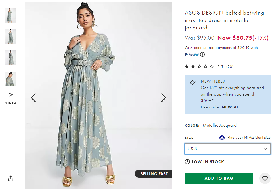
Online store ASOS uses scarcity on its product pages – here, the “Selling Fast” and “Low in Stock” labels encourage shoppers to act quickly, before they miss out.
And it’s also the reason that countdown timers can be such an effective way to increase conversion rate. Essentially, these are pop-ups that appear while a user is browsing a site: presenting them with a special deal, then informing them that it’s only valid for the next ten minutes. This number begins slowly to tick down, dragging the shopper’s nerves (and their willpower!) down with it.
Unsurprisingly, countdown timers can be immensely effective – having, in some cases, increased conversion rates by up to 400%. Cialdini would approve!
Case Studies: How 5 Businesses Increased Their Conversion Rates
Above, we’ve provided 14 examples of how to increase conversion rate. All these sound good in principle, of course. But how do they look in practice?
We’ve pulled together five case studies to demonstrate. The following businesses all understood the importance of a good conversion rate, realized how to increase conversion rates – then invested in making those changes.
And the results speak for themselves.
Walmart Canada

Recognizing that a lot of its traffic was coming from mobiles – but that its mobile site wasn’t doing it any favors – Walmart Canada did an overhaul. It sped up and redesigned its interface for all screen sizes and displays: A/B testing and optimizing to make its mobile experience more responsive and intuitive.
The result? A 20% uplift in conversions across all devices – and a 98% increase in mobile orders.
Voices.com

Voices.com tried a multi-pronged approach to increase conversions. Along with adding video demos and social proof (in the form of logos of companies it had worked with) to its site, Voices.com began segmenting visitors.
And it worked – Voices.com’s conversion rate skyrocketed by an impressive 400%.
Performable

To maximize clicks, marketing automation software provider Performable tested two variations of its CTA button. One was red; the other green.
And after extensive A/B tests, the winner was clear.
Green didn’t mean ‘go’ in this case – the color was outperformed by its red counterpart, which resulted in 21% more clicks.
Intuit

Financial software provider Intuit wanted to find out how implementing a live chat tool would affect conversions across its website, and it found out – in a big way.
By adding a chat tool to the checkout process, Intuit boosted its average order value by 43%. But on a product comparison page, the positive effect of a live chat feature was much starker – increasing sales by an incredible 211%.
WikiJob

For WikiJob – a site that helps job seekers prepare for interviews or aptitude tests – its CRO experiment was to simply move its three testimonials from the bottom of the page to the top.
The site then A/B tested the two variations. The results showed that the enhanced visibility of the testimonials resulted in a 34% conversion rate increase – proof that social proof works!
Conclusion
So, there you have it – 14 tried-and-tested ways to increase your site’s conversion rate.
Here’s a quick recap of how to increase conversion rate for your own website:
- Add exit-intent pop-ups
- Prepare concise forms
- Leverage social proof
- Identifying conversion points from user behaviour
- Remove unnecessary steps from the conversion funnel
- A/B testing onsite pain points
- Write good copy
- Create effective abandoned cart campaigns
- Define and revise your website’s value proposition
- Integrate a chatbot
- Harness trust signals
- Regularly revise your CTAs
- Improve page speed
- Add countdown timers to increase urgency
We’ve listed 14, but – in truth – there are hundreds of small, simple ways to increase conversion rates. And, while they won’t all be successful, that’s all part of the process.
Improving your conversion rate is, after all, neither an art or a science. It’s somewhere in between – in the space where measured analysis meets considered guesswork. The only way you’ll know if something’s going to be successful, then, is to try it – then continue to play with it and practice.
That’s half the fun!
This is a guest by Rob Binns. Rob Binns is a Senior B2B writer on Startups.co.uk, the UK’s leading independent, online resource for anyone starting and growing a business. When not covering the Startup market, he can be found writing about topics as diverse as blockchain to biometrics – and everything in between!
Q1. What Factors Affect Conversion Rate?
There are a wide range of factors that will affect your conversion rate. On a macro level, there’s your industry, country, and the type or nature of the product (or service) you’re selling.
Some of these factors – like the COVID-19 pandemic or a global recession – are out of your control.
But most (like your website) aren’t.
Your site’s UX, design, accessibility, and contents – such as its copy, colors, and the range of resources it offers – can all affect your conversion rate. As can its level of humanity – that is, the amount of trust signals, social proof, and customer service you’re offering.
Your conversion rate will also depend on what you’re classifying as a conversion (which, remember, is simply whatever you’re trying to get your customer to do). For some businesses, this might be the user signing up to an email list. For others, it could be making a purchase.
Q2. What is a good ecommerce Conversion Rate?
A ‘good’ ecommerce conversion rate is subjective – in many ways, because of the variables and factors outlined above.
One site puts it between 1% and 4%; others between 2% and 5%. Another study, updated in 2020, took the averages of 15 studies across half a decade, suggesting that 2.63% is more or less the norm.
Taking all this into account – and that the pandemic has, since 2020, thrust ecommerce even more into the spotlight – we’re inclined to suggest that anything over 5% is a ‘good’ ecommerce conversion rate.
Anything above 10% is excellent!
Q3. How Much Should I Increase My Conversion Rate?
There’s no exact rule of thumb as to how much you should increase your website’s conversion rate by. It’s all relative, and depends on your business’s own, unique circumstances.
Our advice? Don’t get too caught up in the numbers. Simply start by applying the tips and techniques we’ve outlined above, and your conversion rate will begin climbing organically.
Plus, by following the 14-steps above, you won’t just be creating a site that converts – but one that’s infinitely better looking, higher functioning, and more accessible (and aesthetically pleasing) for your users.
Customer Review at 
“Great performance for the price, and plenty of control”
Sean P [SMB Owner]
Najam Ahmed
I work as a digital content producer at Cloudways. Besides that, I love to read, and i love to play the guitar. Fan of all things Arsenal and the Patriots. Occasional gamer. I like to fly drones too. Jack of all trades.
